File Design & Guidelines
Did you know that an incorrectly setup file is the #1 reason for unsatisfied prints result ?
To maintain our top-quality printing, Bali Print Shop require the cooperation of the customer to prepare the file correctly for print. There are a few rules that must be followed to ensure the successful processing of your content. Avoid paying a revision fee to fix unnecessary mistakes by using the below guidelines to get it right the first time.
Before sending us your file for print, please make sure your file meets the following requirements.
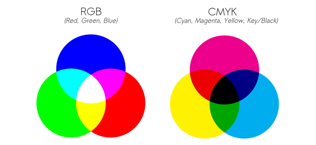
RGB vs CMYK Color Mode
The CMYK color model involves a 4 color process including Cyan, Magenta, Yellow and BlackBPS products are printed using the CMYK color mode. All artwork and images must be provided in CMYK color mode.
You must convert all of the images from RGB to CMYK before sending them to us. When we receive RGB images, it is our policy to try and convert your RGB images to CMYK, without contacting you about the format of your submission. Please note that conversion to CMYK may cause colors to shift. During the CMYK conversion, we do our best to closely match the colors in your order. However, Bali Print Shop (BPS) in no way guarantees that the colors in your converted file will exactly match the colors of the images that you submitted to us in RGB format. We will not be responsible for any imperfections due to your images being sent to us in RGB format.
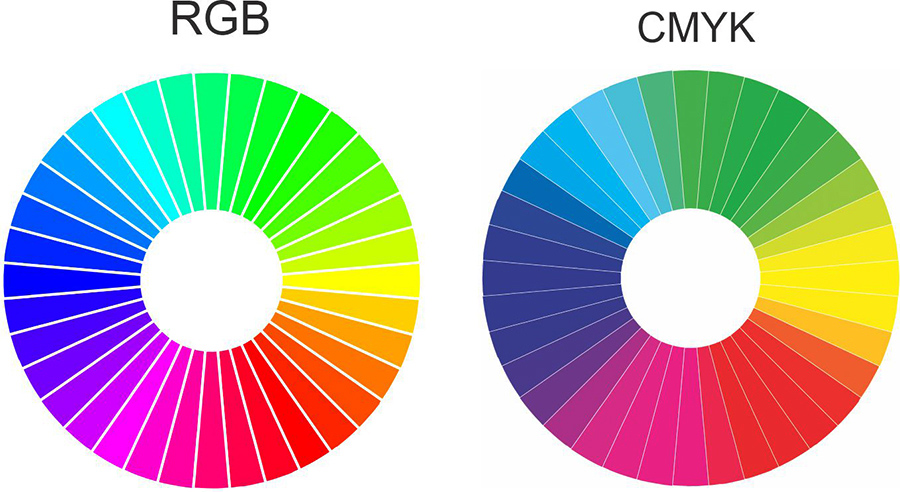
Certain RGB colors when converted to CMYK become dark and dull like sample shown below :
Images Resolution:
If you are scanning the images yourself from photographs it is better to save them in either tif, or eps format. These image formats will preserve the color and sharpness of your pictures the best.
File formats like gif or jpg compress the pictures color and pixel resolution and this can cause color shifts and blurriness. Since jpg and gif are the most predominant image formats on the web, it follows that it's not a good idea to simply lift an image from someone's website and use it in your layout.
If you are using pictures from your digital camera they will work just fine if they are jpgs; the quality of jpg images from digital cameras seems to be much better than jpgs that are used on the web. You must do the math to make sure that it is high enough in pixel resolution though. For instance, if your camera puts out a typical image of 1280 x 960 pixels at 72dpi you get about 43 x 30cm ; this is the same amount of detail as an image which is 10 x 7cm at 300dpi (for Printing) so it's safe to print up to about 10 x 7cm in dimension.
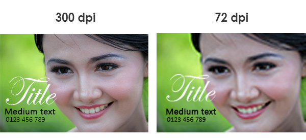
Artwork for most products must have a minimum of 300 DPI or higher. Large format products such as vinyl banners, roll up banners, fabric print, other large format can be 180-250 DPI. For non large format ( Printing on paper material using Offset machine and digital print) must have a resolution of 300 DPI (dots per inch). Images with less than 300 DPI for offset printing will reproduce poorly on the press, causing the image appear fuzzy and pixelated.
When we receive low resolution images, it is our policy to try and convert all low resolution images match with our machine requirement, without contacting you about the format of your submission. BPS will not be responsible for any imperfections due to submission of a low resolution image, as we require all artwork to have a minimum of 300 DPI resolution specially for Offset or Digital printing.
You should not use any images from an Internet website, because the Internet displays images at 72 DPI, which is low resolution and may result in loss of quality. You should also not try to increase the resolution from a low resolution image to a higher one by increasing the DPI, because this also will create a loss of quality.
Tip:
- Zoom in 300% to see the printed resolution.
How do I get a high-resolution picture?
3 ways to get high resolution pictures
- Take a picture on your own camera or phone camera
- Purchase a high resolution stock image from online photo galleries provider
- Search for a high-resolution picture on the web (most are low-res)
Most pictures on the web are low resolution (72dpi) to allow websites to run faster, so if you save a picture from the web, you have to make sure it's a bigger size or higher resolution or you can search image using google image and select tool size. On the results page, click "Search Tools" button and then "Size" dropdown menu to filter the search for high image size.
How should I take pictures with my digital camera?
Digital cameras capture images in RGB color format. The camera is designed to actually take three pictures; one red, green and blue. It then combines the colors together and saves the image to the memory card. It is very important to ensure that the camera is set to the highest quality setting. This means large file sizes and slow downloads from the camera itself, but it will give you the best results from your camera. Remember, photos must be at least 300 dpi.
More often, the image that comes from a digital camera when printed with ink will be darker than expected on the screen. Check to see if you have a brightness option in the image editing program to adjust for this. We recommend that you change the colors from RGB to CMYK colors (cyan, magenta, yellow, black), because it is better if you change, rather than asking us to do it. Remember, not all the colors you see created by the light element (RGB) can be created by the ink element (CMYK) in a print.
How can I tell what resolution the image from my digital camera is?
Some digital cameras will tell you as to the resolution and pixel dimensions of the image there is. You can also find out through image editing software such as Photoshop, you can perform calculations to determine the size that you can print later from the resolution of your image.
Simply write down the Pixel dimensions and divide by 300 for images without Text and divide by 400 if images do not include text.
For example: An Image without any text has pixel dimensions of 600 x 900 pixels. After dividing each dimension by 300, the result is 5 x 7cm. This means you can use this image that is 5 x 7cm or smaller for quality printouts.
We recommend an image that is 300 dpi in the final size in the layout and 400 dpi if the image includes text. Please note that the resolution and physical dimensions are directly proportional to each other. If you have an image that is 5 x 5cm at 300 dpi and increased its size in the layout to 10 x 10cm, the new resolution is now 150 dpi.
So remember, when you hover an image into your layout you can shrink it (because the resolution will increase) but you will be limited to the extent to which you can increase the size.
How well will my piece match what I see on my monitor?
Most people are surprised to see the final result when printed, the color does not match what they made and see on the monitor screen. It is very influenced by the difference in Monitor Calibration and the difference in technology used, some printed colors may not look the same as the colors on your monitor.
Font Sizes and Weights
The right font size depends on the type of print product as well as how big the printed piece will be. For smaller items, such as standard business cards, font size is very important. If the text is too small, it will be very hard to read. Sometimes a font will look legible on a large computer screen, but it will not be the same on the actual 5x9 cm cardstock. The minimum text size for business cards is 6pt. For best results, print your business card in actual size on a piece of paper and review all text for readability.
Font weights can also be a problem for printing. Thin typefaces usually do not translate well in ink. The same can be said for light font weights. There are some exceptions, but in general, we do not recommend light versions of fonts. Choose regular or bold weights for maximum effect.
Converting Fonts & Outline Strokes:
When submitting files to us, you must convert your fonts to curve and strokes into outlines or if you use layer do merge layer / flatten image. Outlining eliminates the need to send fonts along your files, while maintaining a nice, crisp typeface. Outlining fonts may also avoid any problems associated with Identity-H.
Transparencies:
We accept files with transparencies for printing. We recommend that you flatten all submitted transparencies in order to avoid any possible problems. If you do not flatten your transparency, we may flatten your transparency for you without contacting you about the format of your submission and advance your job to print. BPS is not responsible for the outcome of your transparency image.
Common problem : Transparencies are caused by shadows, glows and other effect. Common problem objects created in a vector based platform such as Illustrator, Corel Draw and InDesign. file containing transparency may course problems when printed, the result may become with white box under the transparent object.
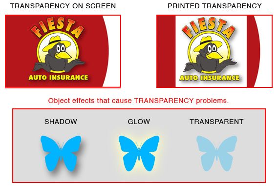
While we understand that using these effects can sometimes enhance the appearance of your design, the best way to avoid transparency problems is to flatten your transparency.
Overprint:
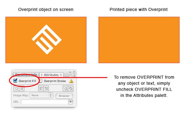
Overprint is a common mistake that happens a lot in print production. It is easy to avoid it but it is even easier to miss it. This is why you should carefully assign correct attributes to the objects and colors used in your design. Especially to the black colored objects and text.
Overprinting is a process of printing one color on top of another. When you set an object to overprint it will overprint any other object below. This means that the bottom object will be printed entirely. On the other hand top object that is not set to overprint will drill a hole in object below. This is also known as knock out.
Rich Black & Pure Black :
When you want an area of solid black background and Big Text for Title within your document, use Rich Black, as represented by C:60% / M:40% / Y:40% / K:100%, because using 100% black (K) only and not a solid saturated black will result in a dull black.
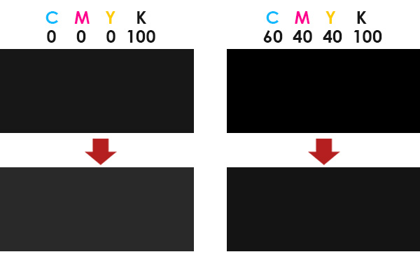
For Medium and Small Text Black use pure black 100% by these percentages: C:0% / M:0% / Y:0% / K:100%. Do not use Rich Black percentage because rich black only good for solid background, ink block, and text title with big font size only.
True Blue:
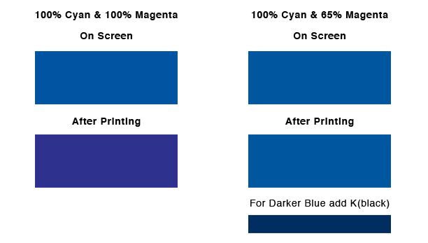
The color blue consists of a color combination of Cyan and Magenta values. The higher the Magenta value, the higher the risk of your blues turning purple. To avoid your blues from turning purple we recommend the Magenta value be at least 35% lower that the Cyan value. For example: 100% Cyan and 100% Magenta equals Purple. Although this combination looks blue on your computer screen, it will print purple.
Borders:
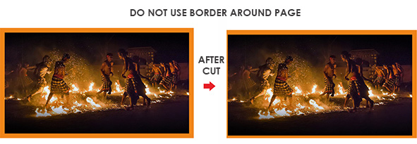
Due to slight shifting that may occur during cutting, it is not recommended that you add a border around your design, as we do not guarantee that your border will remain the same size after cutting. Particularly, when you add a border to a laminate or a UV coated job, there may be slight slipping that may cause some shifting during cutting.
Bleeds and Safety Zones
In order to prevent your image (text or picture) from being trimmed or cut off, the image must be 1/8 of an inch (0.125 in.) from the trim edge of your layout. Any images that are meant to extend into the edge of your design must extend into the bleed area.
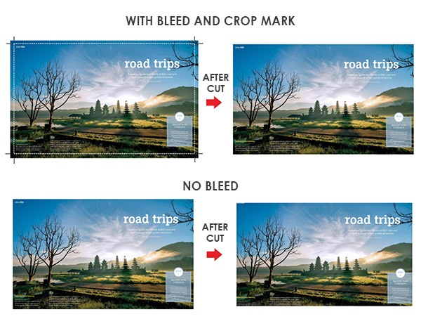
Bleed is a technical term for printing that extends to the edge of a page. For example, a business card final size 4.8 x 8.9 cm, but we require a 5mm. bleed making the file 5.3 x 9.4 cm
All bleeds should be 5mm all around. If your submitted files are missing a bleed, we will try to add the necessary bleed to your files, in order to correct the problem. MahaMeru Bali Printing will not be responsible for any imperfections due to your submitted files missing a bleed, as we require print ready files.
NOTE: Shifting of the blades may occur during the cutting process, which is why it is crucial that submitted files have bleed. If submitted file/s don’t have bleed, final printed piece will have white trimming around the edges.

