Business Cards Printing Design Tips
A business card is one of the first points of connectivity with an influencer or a client. A well-made business card not only makes you appear professional but it also acts as a reflection of your services. Therefore, if you do not yet have a business card to give out to your prospective clients, influencers or collaborators then you are missing out on a great connectivity tool.
A business card should look professional, as it is the face of your brand, a representation of your company and also a great marketing tool. At Bali Print Shop, it is our role to advise our customers on the best possible ways to print the perfect business card.
It is true when people say that a business card is the reflection of your business or service. The moment you hand over a business card to anyone, you and your business are open to interpretation. Thus, it is necessary that you plan a business card design that resonates with your qualifications and services.
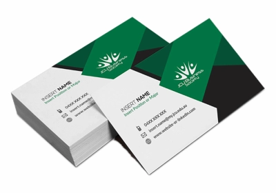
Though you can always be creative in your business card design, as a general thumb rule, it is always better to make your business card design less cluttered with a single icon, vector or logo representing your business. For business card designs a minimalistic approach is preferable.
Before you start your business card design, it is especially relevant that you understand its exact size and shape. Every business card design has four factors to consider – Size, Orientation, Custom Shape & Material (Print or Digital). Let us cover each of the points one by one.
The size of business card design:
The most ideal and widely used business card size is 8.5×5 cm. If you like, you can go for a bigger size 9 x 5.5 cm, but the size 8.5×5 cm is in use for a long time. It fits well into the wallets or pockets and is also easy/economical to get a print version.
The orientation of business card design:
Similar to presentations, business card design also has two modes to choose from, landscape and portrait. You can choose either based on your preference or requirement.
The landscape mode is the traditional and more preferred choice. The landscape mode gives you adequate horizontal space to fill in bigger names or texts related to your brand. Hence, you have the liberty to add a few extra points about your services.
The three most important aspects of your business card design are Color, Font & Contents. Lets us see how to optimally use all the elements to create a beautiful business card.
Prioritize Readability over Creativity
We know, minimalism looks amazing on your business cards, but what good does it make if your customers are unable to read your contents? Your main priorities should be the readability of your card, before anything else. This mainly applies to fonts, the minimum type size of fonts should be no smaller than 6 points. Bear in mind as well, that extremely thin (light) fonts are also not recommended as they bear a risk to appear barely visible in printing.
Other than fonts, other elements such as lines and colors too play a role in affecting your business cards printing result. Clean lines are highly advised to be 0.25 pt at minimum, and colors must be used wisely so that your potential customers won’t have to squint to be able to see what’s going on in your cards!
Always use Process Colors (CMYK)
If your printed business card did not have your expected colors, it may have something to do with the color mode of your artwork. There are several color modes to use when designing any artwork, mainly RGB or CMYK.
The main color mode for printing will always be in process colors(CMYK), should your artwork be in any other color modes (eg. RGB), then the colors may not turn out to be what you wanted. CMYK represents a subtractive model, in which the three colors Cyan, Magenta and Yellow. The Key color Black, are successively printed against a white background.
For more elaborate explanation of the topic, feel free to check out our other blog. And more importantly, make sure to check the color modes of your business cards before printing!
Apply Bleed in your Artwork
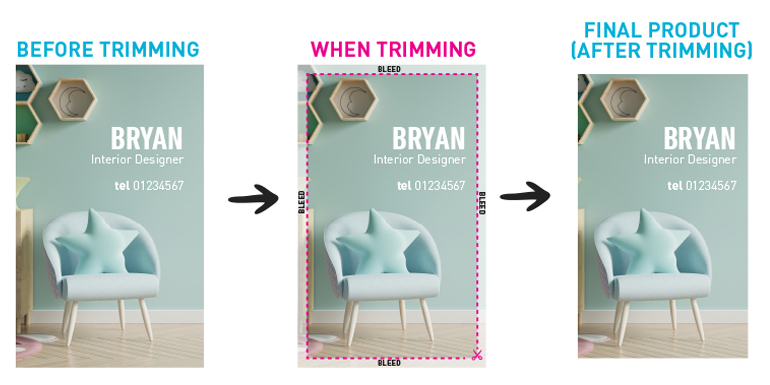
One of our blogs may have this covered. But what is Bleed? You ask. In printing, bleed is the extra part of the side of an artwork that gives printers a small space to cover the inaccuracies of printing. It is in fact difficult to print 100% exactly to the edge of a card. This is why applying bleed is necessary to leave little room for error when the trimming happens! For business cards, the common size for bleed would be in 3mm from the edge of your artwork.
Do not Do Hug the Edge
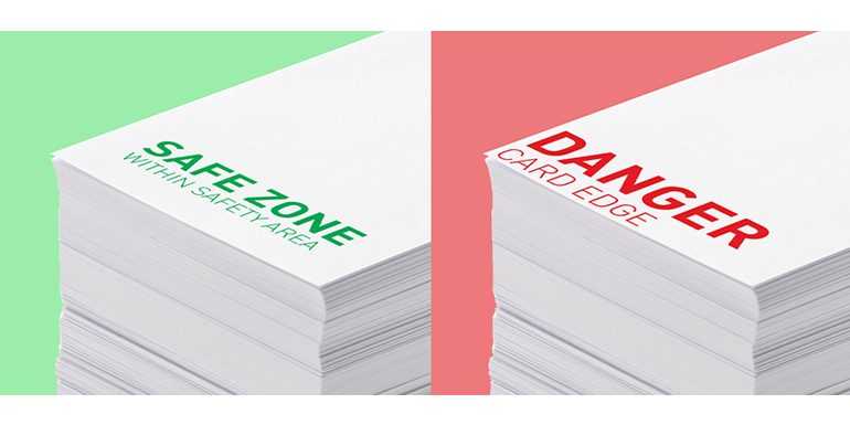
Does it feel scary to stand near the edge of a cliff? That is what’s happening to your contents as well. In other words, don’t place your contents very near to the edge of your card. Just like Bleed, we also have cutting margins to consider for any printed artworks.
As we said about how printing is not 100% accurate, it is risky to apply your information close to the sides. It is recommended to have a 3mm margin from the edge for business cards. This is due to the fact that the trimming inaccuracy can happen anywhere between the bleed and the safety margin. Cutting / Safety margins are pretty much “safety zones” that your content should not exceed to avoid accidents, like having your important information cut out of the card!
Don't Use Raster Based Softwares
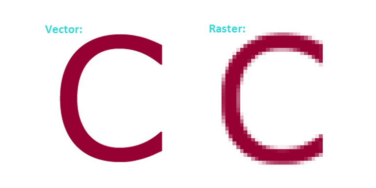
Unfortunately, softwares like photoshop is not the answer to everything, these programs may be handy but it is highly recommended not to use them for business cards. This is because the text / logo generated from Photoshop will always be exported as a “raster”, making your text / logo slightly pixelated as a result. To get sharp and clear printing of your cards, we would highly recommend using Vector based software's, programs like Illustrator, InDesign, Canva or even Word / PowerPoint can support vector graphics.
Don't Use Borders
It is indeed awesome to have cool straight lines around your business cards. However, as pretty as it looks, it is generally advised against due to the inaccuracies of printing. One small wrong movement between the printing mechanics can sometimes cause your borders to look centralized. That is not to say that borders or frames aren’t allowed in business cards, we would never limit anyone’s creativity! But just to keep this in mind that great borders come with great liabilities. :)
