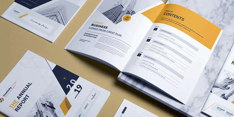
Tips for Designing Annual Reports Book
Annual reports may sound boring, but they don’t have to be. With an appealing design, annual reports can be a powerful promotional tool by drumming up enthusiasm for your company or organization.
An annual report is a business's yearly report to shareholders that documents the finances and activities of the business's past year. Now more than ever, it is vital for businesses to present themselves in different perspectives, and annual reports have the ability to do just that. Nearly every organization or business out there needs to put together an annual report booklet to professionally document the company’s financial growth and overall mission.
Every annual report is a chance to share what sets your company apart. But the way in which companies are choosing to present their reports is changing. Today’s best annual reports incorporate elements of infographic-inspired design, including data visualizations, illustrations, and icons. They lean on visual content to communicate their message, because that content is easier to parse and more engaging for audiences.
An annual report is an important extension of your brand’s story. Presenting that information in the best package possible is crucial, yet many brands overlook the power of annual report design. That’s a shame, especially when you have so many tools at your disposal.
Through photos, illustration, data visualization, color, typography, and more, you can easily turn copy and numbers into a beautiful and interesting story that captivates the viewer. Want proof? We’ve got it.
VISUALIZE YOUR DATA
What Topics Should I Include In My Annual Report?
Sometimes, it’s easier to get the important content together first before you even concern yourself with designing. Get together with your team to come up with content, statistics, graphs, and more to fill out answers to the following topics:
- Generally describe the industry that your company belongs to
- Company logo is a must
- Introduce your business’s mission and long-term goals
- Letter from the Founder or CEO addressing the company's fiscal position
- Financial reports
- Describe the business from an overall standpoint from the past year
- Detail information that is relevant to the business’s various segments
- List the company’s executive officers and the number of employees in entire company
- List the Market Price of the organization’s stock
- And anything else that is relevant for your organization
Pick your Theme
Now that you have all of your content together, you can take the time to organize it along a theme. Facts and graphs aren’t enough to maintain the reader’s attention. Who will be reading your Annual Report? How can you appeal to them? Try to morph all of this information into a story that your readers will respond to.
Don’t forget to stay on brand with your theme. The theme should be in line with your company’s goals and mission. For example, if your company is a nonprofit, tell a purposeful story. Not only can you provide the information that is necessary, but you can use success stories from your organization’s efforts to tie the entire report together.
Create or Choose your Layout Design
If you have a professional designer on staff, great. Put together visual examples of annual reports that you like the style of in a “mood board” folder. This will help your designer create a template layout that will keep you happy.
Don't stress if you don't have a graphic designer on staff. There are many options for you to create an Annual Report Design that won’t haunt your dreams for the rest of the year.
No matter which route you go, make sure that your design stays in line with the brand identity of your business. From your annual report cover to your annual report layout, stay on brand. Colors, logos, and fonts will instantly tell the reader which company this annual report is coming from and the consistency will reassure them of your success.
Data Visualization
First of all, remember that the best annual reports communicate in a variety of ways. For your next report, infographic-inspired elements can help give readers’ eyes a break.
One thing you can’t avoid in creating an Annual Report is that…data can be boring. When displaying your finances and various charts/graphs, make it pretty! Take the time (or pay the money) to create an easy-to-read method to data visualization.
In this print report for sample, bold charts and graphs break up the content. And of course, they put the data front and center. This makes it easier for readers to draw quick conclusions and recognize trends in the data. That would be hard to do if the information were buried in a paragraph.
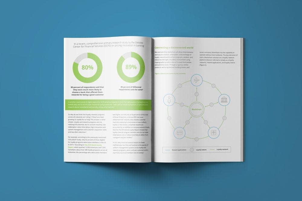
When you get your data into a well-visualized chart, use it to create an infographic. Infographic pair data visualization with typography to help guide a reader through the information. Venngage offers some Fun Data Infographic templates that might be useful during this phase of report building!
ILLUSTRATE A STORY
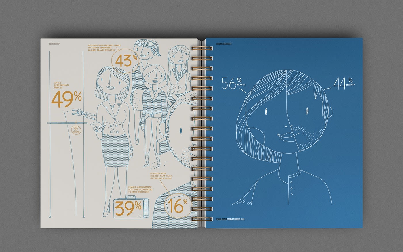
If your report isn’t data-heavy, you can still incorporate other visual elements. First, invite readers to look inside with a unique cover page. Then, use illustrations to break your report into clear sections. Icons will help draw the eye to key concepts.
All of these elements can work in tandem to tell a larger story, and help your readers draw conclusions. And if you do have some data to share, great! It can form a critical piece of the visual story. This annual report from travel agency Noord exemplifies a visual story that’s fun to explore. Data and characters are rendered in a creative, hand-drawn style.
USE PHOTOGRAPHY BOLDLY
Photography is a tried-and-true visual element in annual reports. It can add a human element, or bring your products or services to life.
Bold photography can help balance longer blocks of text. Just make sure to choose high-resolution photos to ensure your annual report looks its best. Also, keep in mind that the best annual reports go outside the box. Subtle cropping or masking can elevate your whole design. Just don’t go overboard.
CREATE AN INTERACTIVE EXPERIENCE
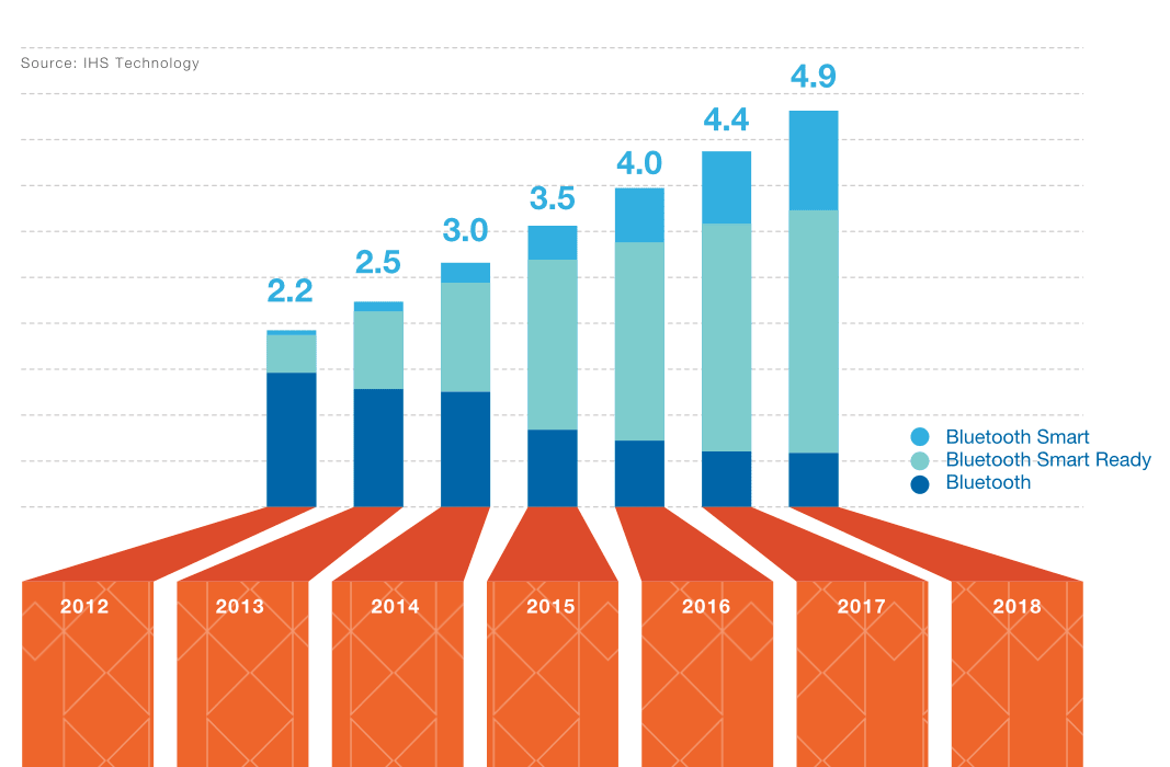
If your goal is to encourage more people to read your report, consider an interactive microsite. Check out this annual report for Bluetooth, which helps readers focus by showing the most relevant data. Notice how the subtle animations encourage scrolling. Even simple movement can enhance the reading experience.
SHOWCASE MULTIMEDIA ELEMENTS
Your annual report is an opportunity to show the best of your work from the last year. So why not make the most of what you’ve created already? An interactive piece also allows you to embed new content or existing assets, like videos or social-media posts. This interactive report for readers in with animated icons. Then it links to videos, blogs, and other highlights. It’s strategic and engaging at the same time.
ADOPT MULTIPLE FORMATS
The more data you have, the more it matters how you present it. So if you bury data in a long report, readers might never find it. Maybe you want to appeal to casual readers, while making your full data available to those who want a deeper dive.
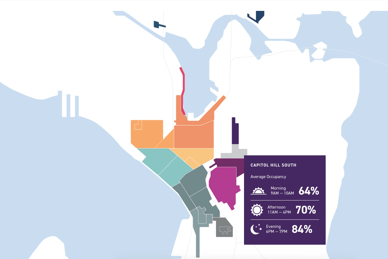
This report for the Seattle Department of Transportation pairs a printed report and an interactive experience. As a result, readers get to choose how they explore more than 20,000 data points. Above all, it appeals to more people than either of the 2 formats would alone:
OPT FOR AN ANNUAL REPORT INFOGRAPHIC
An annual report infographic uses a range of visual techniques. This approach pares down text, relying on illustrations, icons, and data. Sinai Urban Health Institute’s annual report infographic embraces this less-is-more approach to text. The result is reader-friendly and driven by data.
Popular Annual Report Printed Specs
So you have the content, theme, layout design style, and data visualization figured out, what else could there be? It’s time to decide on the specs of your Annual Report Booklet. Here are some popular booklet specs for Annual Reports:
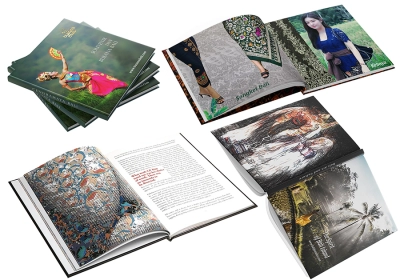
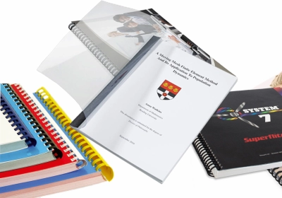
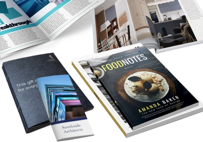
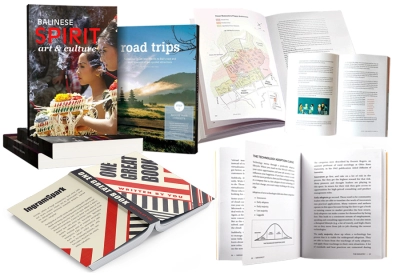
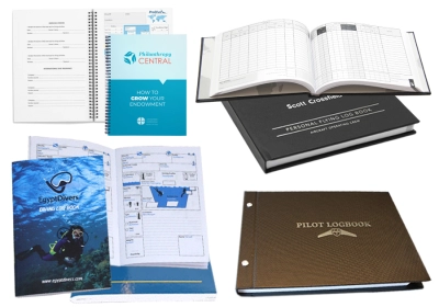
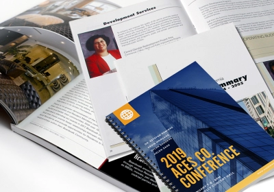
- Binding: Soft Cover Perfect Binding is our most popular binding type for Annual Report Printing. It is so professional that your shareholders will immediately be impressed. With Perfect Binding you can add text to the spine, so you can add the year on the side for easy navigation on the bookshelf. Or you can use Wire-O spiral. Size: The most common size for Annual Reports is your standard A4.
- Paper: We recommend 150gsm for the inside paper and 260gsm for the Cover. This will ensure that your brand colors and images throughout your book will POP and keep the reader interested.
- Coating: Adding a Gloss or Matte laminate to your Annual Report books will add that extra level of professionalism as well as prevent scratching.
Now that you know what all needs to go into your annual report book printing and how to arrange it in an impactful way, I bet you’re not nearly as intimidated by the project. Even if you are, don’t forget that Bali Print Shop is here to help you. Give us a call and we will be happy to assist you throughout the process.

